Draw to Learn: Strategies for Powerful Visual Thinking in Classrooms

Today we dive into Teaching with Diagrams: Classroom Strategies for Visual Thinking, turning sketches, maps, and models into everyday learning engines. Expect approachable routines, design tips, inclusive practices, and teacher-tested stories that help every student organize ideas, argue with evidence, and remember deeply.

Why Diagrams Accelerate Learning

When learners externalize ideas as lines, shapes, arrows, and spatial groupings, thinking becomes shareable, revisable, and memorable. Dual coding pairs words with visuals, reducing ambiguity and strengthening recall. A ninth-grade biology class improved explanations after mapping cell processes, because the diagram demanded precision where language once blurred connections.

Designing Diagrams That Think With You

Clarity is a design choice. Selecting the right form, crafting labels that guide attention, and balancing white space with detail turns a diagram into a partner for reasoning. Teachers do not need artistic flair, only purposeful conventions, predictable symbols, and the courage to edit until insight feels effortless.

Choosing the right visual form

Flowcharts model processes and decisions, concept maps model relationships, timelines model change, and coordinate planes model variation. Pick the form that mirrors thinking demands. When the representation fits the logic of the task, students stop decorating and start explaining, because the container naturally nudges the kind of reasoning required.

Labels, hierarchy, and white space

Short labels beat paragraphs. Use meaningful headings, numbered steps, and consistent icon sizes to signal importance. Leave breathing room around key nodes so eyes can pause and compare. When every millimeter shouts, nothing speaks; when hierarchy whispers directions, students navigate effortlessly and focus on cause, contrast, and consequence.

Color and contrast, thoughtfully used

Color should encode meaning, not mood. Assign one hue per category, keep saturation moderate, and reserve bright accents for exceptions or alerts. Ensure contrast for readability and provide patterns or textures as backups. Thoughtful color reduces scanning time, prevents misinterpretation, and supports learners who rely on non-color cues to understand.

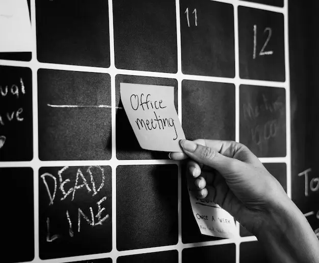
Everyday Classroom Routines for Visual Reasoning

Routines transform intention into habit. Quick sketch warm-ups, partner mapping, and gallery walks make visual thinking ordinary and low-stakes. A history teacher reported fewer blank stares when bell-ringers asked students to draw a claim-evidence diagram, because pencils invited action while lowering the fear of polished, perfect answers.

Assessment and Feedback That Cultivate Clarity

Evaluate thinking, not artistry. Rubrics can honor accuracy of relationships, completeness of labels, and quality of evidence. Short cycles of revision beat single high-stakes submissions. Exit tickets that request a micro-diagram reveal whether understanding transfers. Invite students to annotate changes, explaining how feedback reshaped reasoning and strengthened explanations.

Tools, Materials, and Workflows That Actually Work

Great visuals come from smooth logistics. Stock analog kits for immediacy, deploy simple digital platforms for collaboration, and capture artifacts predictably. When materials are always within reach and sharing is frictionless, you buy back minutes for thinking. The best workflow is the one students barely notice while learning deeply.

Analog kits for instant readiness

Equip tables with index cards, sticky notes, fine-tip markers, rulers, and colored pencils stored in labeled caddies. Include reusable templates for timelines, grids, and flows. When setup is zero-effort, participation spikes. The kit signals that sketching is normal, expected, and valued as a first-class way to explain thinking.

Digital platforms that stay simple

Choose tools with infinite canvas, easy shapes, and quick sharing. Prioritize low login friction, device agnosticism, and version history. Avoid feature bloat that buries learning under menus. When students can drag, link, and label without tutorials, collaboration thrives, and the tool disappears behind the conversation it was meant to support.

Supporting multilingual learners and diverse thinkers

Pair key terms with pictograms and home-language glossaries. Encourage students to sketch first, then layer words. Offer sentence starters for describing relationships so language grows alongside ideas. This honors strengths in spatial reasoning while building vocabulary, ensuring learners contribute insights even before full linguistic fluency is comfortable or secure.

Designing for accessibility from the start

Use readable fonts, generous spacing, and high-contrast palettes. Provide textures and shapes in addition to color signals. Add descriptive alt text for digital diagrams and verbal walk-throughs during instruction. Accessible design is not an accommodation afterthought; it is a universal design stance that benefits every learner in the room.

Culturally responsive visuals that invite identity

Feature examples from community contexts, local systems, and familiar narratives. Invite students to choose symbols that reflect their experiences, then co-create a legend. When learners see their worlds mapped with respect and accuracy, participation rises, misconceptions surface safely, and shared ownership of knowledge deepens across backgrounds and perspectives.

Zoripexiravo
Privacy Overview

This website uses cookies so that we can provide you with the best user experience possible. Cookie information is stored in your browser and performs functions such as recognising you when you return to our website and helping our team to understand which sections of the website you find most interesting and useful.